Friday 27 March 2015

Unit 30 Task 8 D2

File Format; When I changed the file format from the original image to a PNG, the image quality didn’t deteriorate however the file size increased. The image looks very similar to the original image however some of the colours are not as bright.  I also changed the file format to a JPEG. This decreased the file size and no quality was lost from the image. This would be an ideal way to save the image because the image is still of a high quality. The biggest difference I noticed was when I changed the file format to a GIF. The file size decreased from 1.1M to only 403. 3K. This made the image lose quality.

Compression Techniques; I saved the overall image as a JPEG because I thought it was the best quality. I then compressed the image from a quality of 100, 50 and 25. As you can see, the original image compared to the 25 quality image is drastic. The colours are not as bright and bold as the original image however the file size is 145.9K. The image is also pixelated. The 50 quality image is a bigger size but the difference in colour isn’t very clear with the 100 quality. The difference in the compression is shown clearly when you compare all of the images to the 25 quality image.

Colour Depth; I then changed the file type to GIF and changed the colour depth. The top two images are nearly identical and that is with a depth of 256 colours. The file size is 403.3K. I then changed the colour depth to 64 colours. The difference between the two colour depths is that the 64 colour depth isn’t as bright and the image looks quite distorted, especially in the grey area. When the colour depth is the worst when only 16 colours are used. The top of the image has lost colour and the outline of the image is lost. Although the image size is less than 124.5K, the quality of the image has been lost.

Friday 13 March 2015

Unit 30, Task 4,P4 & P5


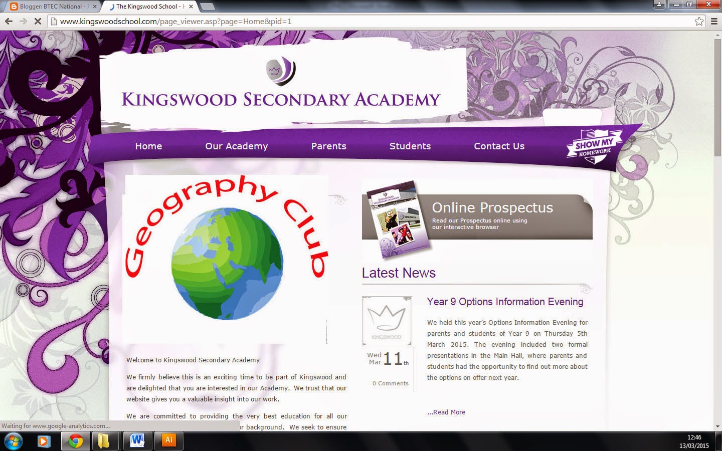
The purpose of my logo is to advertise a geography club in school.The logo is going to be used on a van, leaflet and a website

Feedback; Victoria gave me feedback on my logo and suggested to improve the logo by making the colour of the text brighter. This would make the logo stand out more on the van and leaflet.


I improved my logo like Victoria suggested and changed the colour of the text to red.


Webte;


van;

Leaflet; 


Tuesday 10 March 2015

Unit 30 Task 6 P6

Unit 30 Task 6 P6
Intellectual Property is the creation of the mind, Meaning what you invent is yours for example designs and symbols. IP is protected in law this enables people to earn recognition and financial benefit from what they have created. 
There are many legal pitfalls involved when using and editing graphics. Copyright is when the owner of the image or document has the right whether their image can be edited by anyone without permission or not edited at all. If someone wanted to reuse an image that has copyrights, they would need to get permission first and if they did not get permission, it would be illegal. Copyright allows the owner of an image to have the rights over their files. This is a good thing because their ideas/images can be protected and prevent people from copying their ideas. 
An example of copyright in education is when a student copies an image from google or a piece of work off the internet. When over a certain percentage is copied, the student has to state where they have got the information from if not then it is called plagiarism.
Trademark;

Trademark is a symbol which shows a company has been legally registered or established. It allows you to protect your company as it restricts others from using the logo or company name.  Companys such as ‘mcdonalds’ have trademark. It appears as a small ‘TM’ next to the company name. Trademarking also adds value to your company and lasts for 10 years.